
That is a deep question, and entire books have been written on the subject. One current definition of a good image might simply be one that causes the viewer to pause as he scrolls through the mass of online images available today. But that really doesn’t answer “What makes it good?”
Composition refers to the organization of the elements in the frame in the most interesting manner achievable, to create order out of the disorder in the scene in front of you. The ultimate goal is for the image to have visual impact and evoke a strong emotional response in the viewer. Edward Weston wrote, “To compose a subject well means no more than to see and present it in the strongest manner possible.”
Many good photographs have strong graphical design elements such as line, shape, form, color, tone, texture and pattern. Others simply capture a memorable moment in time. Jay Maisel summarized his opinion on the key components of a quality image in three words: Light, Color and Gesture. Obviously, light and color are essential elements that make up any image (provided it is not monochrome). For live subjects, gesture—the pose of the subject— can make or break an image. But Maisel believes that all images have “gesture,” an essence or expression at the heart of the image, the “It” factor in an image.
Often the success of an image is dependent upon what is excluded from the frame. Bruce Barnbaum, author of The Art of Photography, notes that “the ‘unimportant areas’ of the image are just as critical” to its success. He further states, “I have learned over time that it’s usually the insignificant things within the rectangle of your image that destroy the photograph.”
I personally tend to look at it this way: all parts of an image influence its quality. Any element within an image will have one of three possible effects. It will either add or detract (subtract) from image quality, or be compositionally neutral. And it is important to remember that qualities such as light and color can be image elements. It is the sum effect of these elements that determine the relative merit of an image. A great moment captured can be ruined by poor light and/or busy distracting foregrounds or backgrounds.
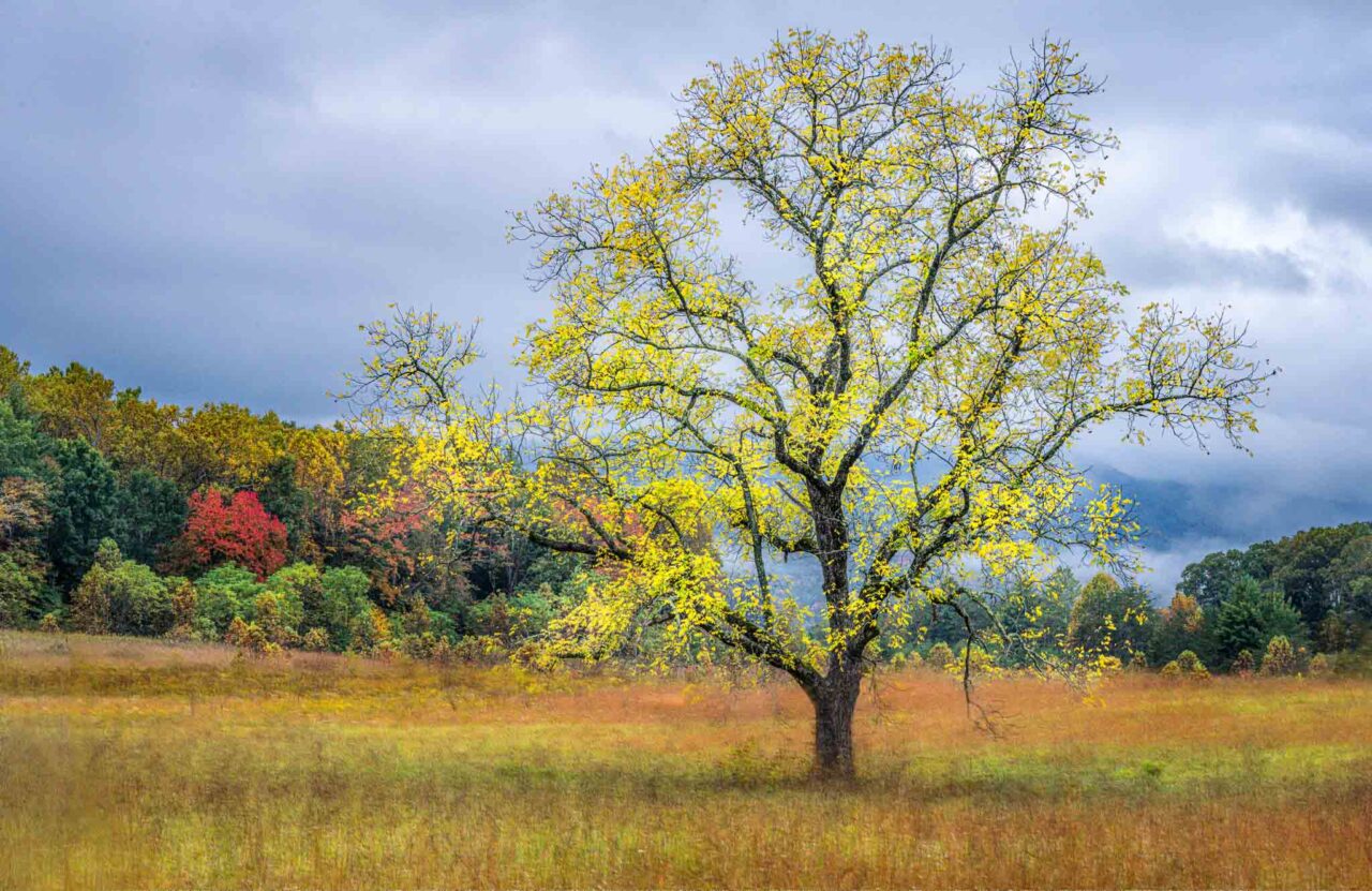
Above image: A memorable moment captured can be all that is required for a good image, provided there are no distracting elements to degrade its impact.
Ideally nothing should remain in the frame that does not in some way enhance the composition. Often the only way to eliminate distracting elements is to narrow the view and simplify the image. This concept of “less is more” is generally a good guideline, because it is uncommon to find a scene where a large number of different elements all work together to enhance the composition. It is easier to create order and visual harmony when there are fewer elements involved.
So simplifying the image is a reasonable guideline, but always be on the lookout for that rare situation when many elements do come together to create a truly exceptional image. So “less is more” is not really better. It’s just easier to accomplish. When you find “more” that actually works together, you can create a better image. In these images there will be more elements within the image to hold the viewer’s attention, to engage his interest.
In the image above, I was in my blind photographing the ducks on the lower right, when I glanced over the top of the camera at the wider scene before me. This was one of those times when “more” was better. The composition was immediately apparent. I wanted to balance the right foreground ducks with the groupings of ducks on the left side. The only problem was the zoom lens I was using could only include half the image width needed. So I took images of the right and left sides and stitched them together in Photoshop.
With wildlife photography, I often tell myself that the subject is the least important part of an image. It is an exaggeration to be sure, but I find it helpful in both approaching subjects in the field and evaluating the resulting images. This thought is generally the deciding factor on whether or not I will even take a photograph.
Accomplished wildlife photographer Tom Mangelsen agreed at least partially when he wrote, “[T]he subject may not always be the most important element in a picture. To me, the quality of light surrounding the subject is generally more important than the subject itself.”
Let us consider an image of an osprey at the nest as an example. There are thousands of osprey/nest images available for viewing online and in books and magazines—in almost every possible pose or position imaginable. So what do you think separates the really good images from the others? What is going to make you pause and look at one image a little longer, a little more closely? It is often not the osprey itself, although it is certainly very important. It is quite likely the other elements within the image that really make it stand out from similar images we have seen before—the positive elements that add visual impact, as well as the lack of subtractive elements.
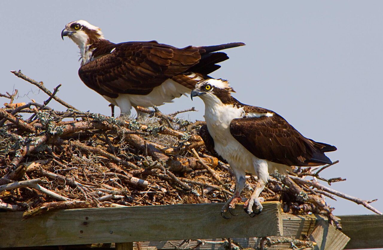
Below are two examples, both images of ospreys at the nest. Although both have some negatives, I think one stands out as much better compared to the other. The pose and positions of the osprey pair in the first image are positive factors. The major negatives are the bland background and the artificial nest platform. This image is quite similar to many osprey nest images that we have probably seen before.
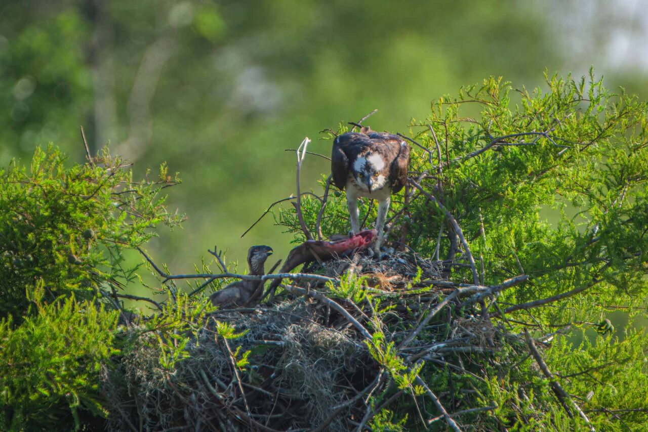
I believe the second image is better for several reasons. First it is a natural nest with close to an eye-level view into the nest, and a more pleasing background. The presence of the young osprey and fish in the nest are nice additive elements. The stare-down by the adult osprey is the “gesture” that also adds to the image. It is the more unique and visually interesting image.
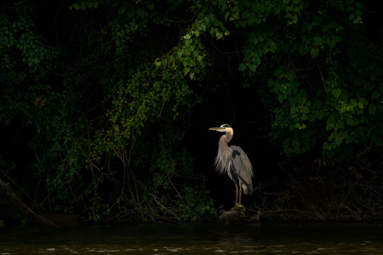
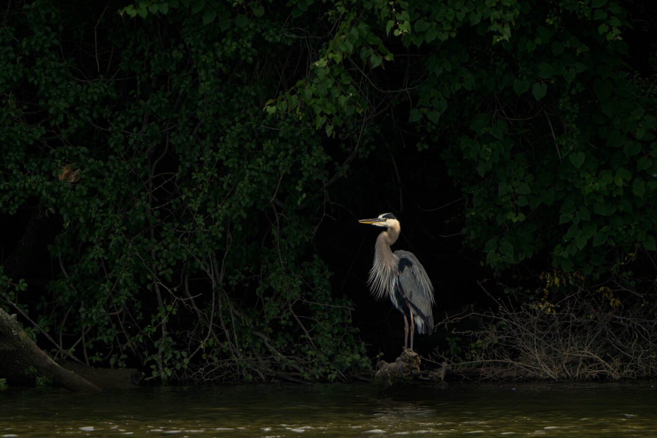
Another example is the image below. The Great Blue Heron is a common bird that I have seen many times during my photo excursions. What makes me stop to photograph one is not the bird itself but the light and scene around the bird—in other words, all the other elements in the composition. I immediately noted the position of the heron in the shaded opening and the surrounding attractive foliage. There were some negative elements— the distracting branches and roots along the shore line— but I was able to darken them during post-processing. You can view the image before and after editing later in this article.
For moving subjects it is helpful to anticipate their direction of movement. Look where the subject is heading. Is it moving toward an area with good lighting and pleasing foreground and background elements? Position yourself so that you are ready to capture that moment.
In the image below, trees and shrubs were blocking some of the early morning sunlight from the pond. I would watch as the ducks would swim through areas of light and shadow, and focus my lens on one that appeared to be heading into a sunlit area. I triggered the camera when a pleasing combination of subject, light, shadow and color occurred.
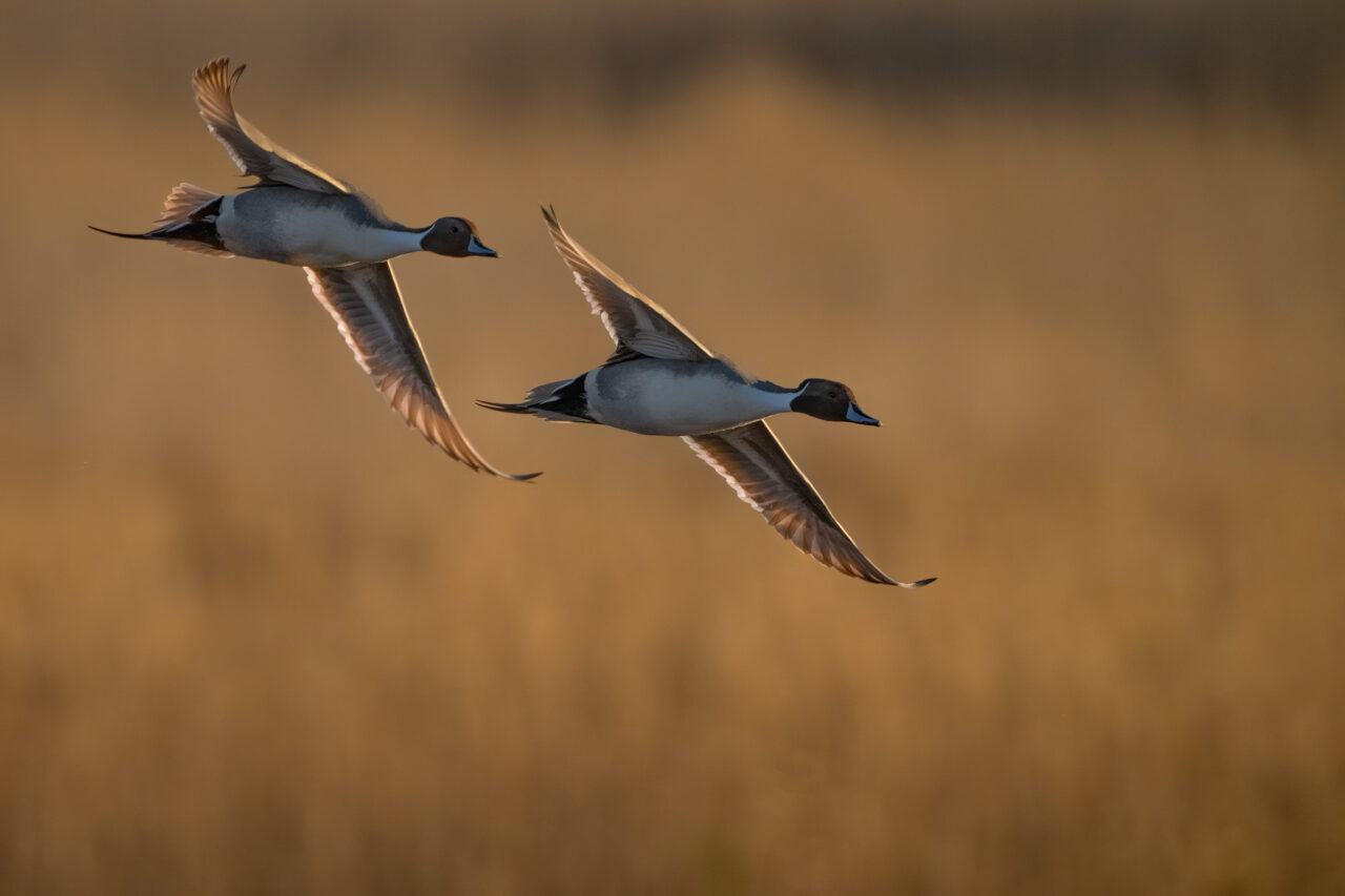
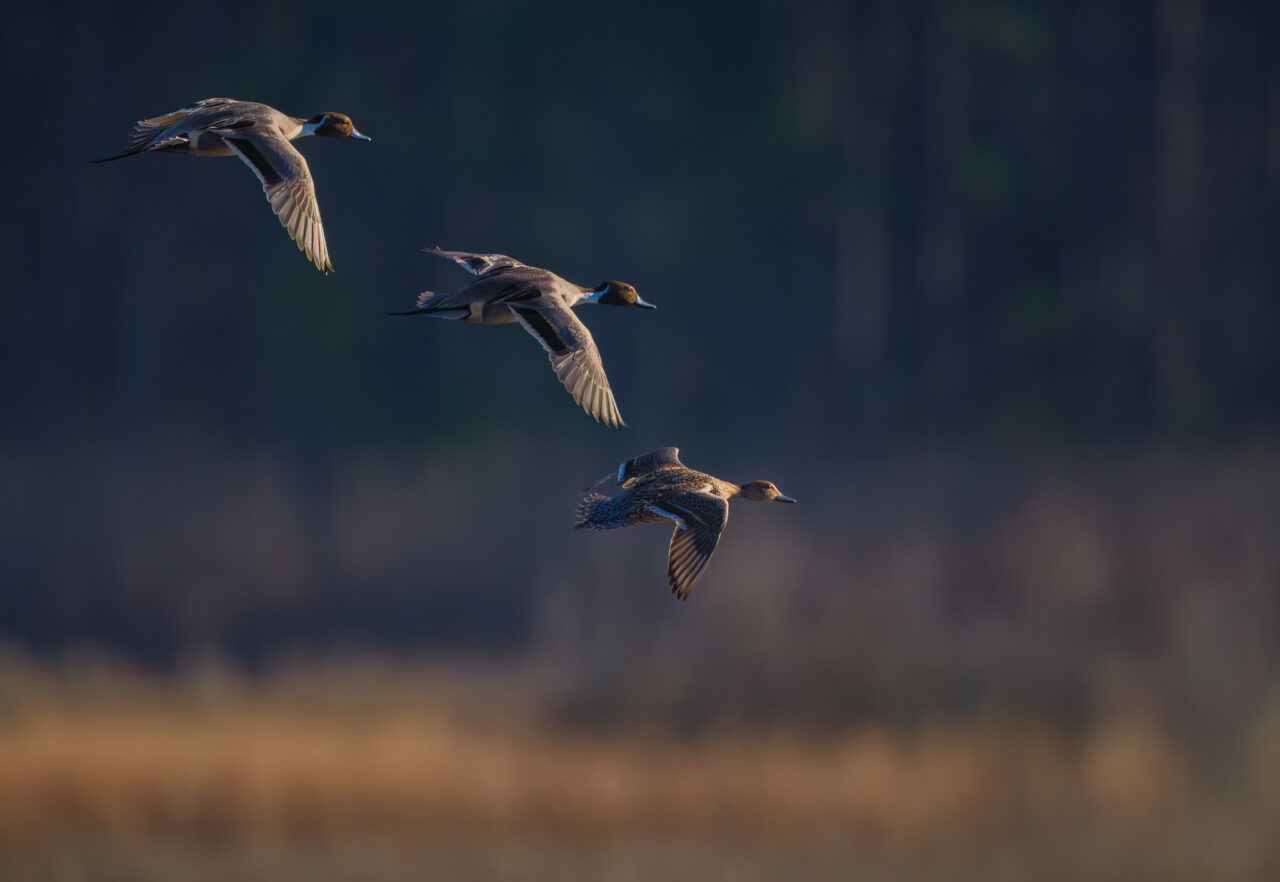
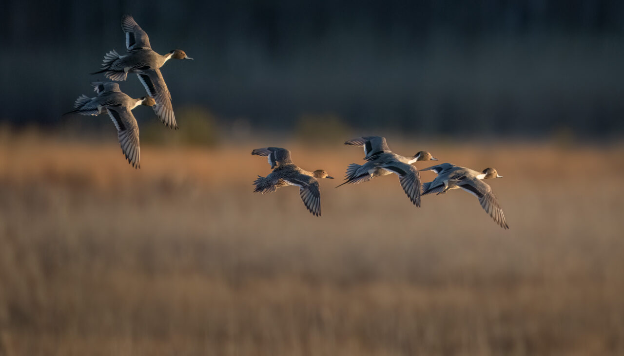
I was at a national wildlife refuge when I photographed the three images below. There were hundreds of very active northern pintails on the impoundment, performing numerous courtship flights. The lighting varied between sidelight and backlight and some portions of the scene provided a beautiful marsh background. Other areas of the impoundment included open water full of resting waterfowl. The images of pintails in flight over the open water regions were not pleasing due to the numerous out-of-focus white tundra swans in the scene. In my images they appeared as horrible distracting white blobs. So I concentrated my attention on the marsh background and would photograph the pintails as they flew across it.
Framing the Scene
So we come upon a scene that inspires us. How do we best capture it as a two dimensional image.
There are obviously technical camera choices to be made: aperture (desired depth of field), shutter speed (freeze action or show motion), lens focal length (angle of view, relative size of near and far objects), etc. But I’m not going to dwell on these aspects now. I am more interested in discussing the design or organization of the elements of the image–the composition of the image.
It is vitally important to remember that our eyes “see” differently than the camera. Our eyes do not see the whole scene at once. The eyes continuously scan the scene, recording it in sections. Each section is a segment of the scene captured at approximately a three degree angle of view. The eye also does not scan in an organized manner, such as a copy machine. It darts about the scene in a seemingly random fashion. It is our brain that organizes these scanned segments into an image. Our mind’s visual interpretation of the scene differs from the actual scene. Some parts are emphasized and others are ignored. The image is simplified to a degree. For example, we may just tend to see a red car, not how the light reflects differently off different parts of the car. We may not even notice that the color of the trim is different. Our mind recognized the object as a car and mentally interpreted it no further. Common, regularly seen objects tend to be “seen” in this manner, unless one has a particular interest in this type of object.
The camera records everything in the scene–all the things that our mental image glossed over. And it records it in a flat two-dimensional form. Our mental image is three dimensional because our eyes have stereoscopic vision. This mental image has depth which adds a degree of separation or order/organization to a scene that will not translate to a two dimensional image.
Because we see differently than our cameras, we can be sometimes be surprised by the resulting photographic images. The bird in a scene may be a lot smaller than we remember it. Where did all those bright distracting colors at the top of the frame come from? And of course you didn’t see the telephone pole that was directly behind your subject.
Ansel Adams gave a visualization device to all participants at his workshops. It was a framing card or “cut-out,” a piece of mat board with a rectangle cut out of it that had the same proportions as the film format or camera sensor. You were to close one eye and view potential scenes through the cut-out, as a means of visualizing how the subject might look as a two-dimensional photograph. By varying the distance of the framing card from the eye, one could simulate different focal lengths. Charles Cramer, a former student of Ansel Adams and later a teacher at Ansel Adams workshops, was still using a framing card in 2020.
With digital cameras we can capture an image and immediately view it on the back of the camera, getting instant feedback on how the scene looks as a digital two-dimensional image. Thus today’s photographers are able to quickly view how the camera “sees” the scene. Mirrorless cameras have a further advantage in that we are able to view a digital rendering of the scene live through the viewfinder–able to see how it is exposed and how shadows, highlights and depth of field are rendered.
The Art of Composition
Photographic Composition can be defined as the artistic arrangement or placement of visual elements within the image frame. These visual elements can be recognizable physical objects or they can be abstract elements of implied lines, shape, form, color and tone. It is how we decide to arrange these elements that decide image success or failure.
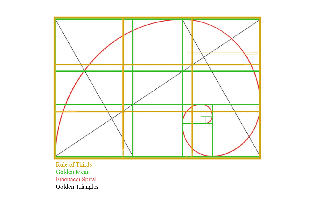
Many photographers cite the importance of “rules” of composition as guides for arranging the elements of an image. Examples of these rules include the Rule of Thirds, the Rule of Odds, the Golden Mean, the Fibonacci Spiral and the Golden Triangle. Other photographers argue for a more intuitive approach.
There is definitely a divided opinion on the usefulness of rules in composing images. Below are some notable quotes on the subject that I have found in my readings.
Photographer James Cowman, on his website, the Art of Composition, states, “The most destructive and counterproductive myth in the art world today is that composition is intuitive. This nonsensical approach to creating art has led artists and photographers down the wrong path for over a century.”
Ansel Adams obviously disagreed with the above opinion when he said, “The so-called ‘rules of photographic composition’ are, in my opinion, invalid, irrelevant and immaterial.” Michael Freeman, author of the bestselling The Photographer’s Eye, writes, “If you follow anyone’s rules to get somewhere in photography, the images will be boring by definition. In fact, if there is anything more tired and limp than ‘here are the rules,’ it’s ‘break the rules,’ a double disaster.”
Edward Weston: “To consult the rules of composition before making a picture is a little like consulting the law of gravitation before going for a walk.”
Galen Rowell is a little more reasonable in his criticism. In his book Mountain Light: In Search of the Dynamic Landscape, he writes, “Even though rules of composition are taught in photography and art classes, there are no absolutes. Composition results from a long series of choices and compromises . . . In my opinion composition boils down to nothing more than pleasing the eye. A good intuitive sense goes a lot further than a headful of rules.”
He also states, “Over the years I have developed a method to avoid thinking in terms of halves, thirds, quarters, or the golden mean as I compose a landscape: I always begin by spontaneously balancing the features I have chosen by intuition. I look for the most important convergence of light or form and try to decide where to place it in my picture. If a certain framing feels right, I go with it. Only when it doesn’t, or when I have too many other factors to consider, do I use a rigid procedure to achieve a balanced composition that does not appear contrived. My Nikon cameras have a 12 mm circle in the viewfinder representing an area favored by the exposure meter. This circle occupies roughly the center third of the 24mm-by-36mm frame. I place my subject at the edge of the circle and move it around until it feels best. The Nikon viewfinder circle works well for this selection process because of the very randomness of all the points on its perimeter . . . None of them touches a grid intersection of halves or thirds, and they neatly solve the problem of making a harmonious composition.”
Modern camera viewfinders no longer have the visible circle denoting the center-weighted metering area. But it is interesting to read the method Galen Rowell sometimes used to achieve a balanced composition, particularly his deliberate effort to avoid a “contrived” composition, i.e. placing the subject at an intersection on the rule of thirds grid.
It seems that respected, accomplished photographers are more likely to favor the intuitive process in composition. Years of experience are probably a major factor in advocating this approach. I think most beginning photographers will, however, find some rules helpful as guidelines for composing images.
I have simplified my approach to compositional rules. I don’t think of the rule of thirds or the golden mean. My one major rule is: Don’t put the main subject in the center of the frame unless it really looks best there. Subjects that looks best centered are generally large symmetrical subjects. Or main subjects that are balanced by other elements on either side of the centered main subject.
When your image has a horizon line, its placement is a similar consideration. Don’t place the horizon line in the center unless it really looks best there. A frame divided in half generally implies a relationship of the two. If the two halves are not of similar importance, don’t place the horizon line in the center. A subject and its reflection is one example where a centered horizon line may work well.
When there are multiple elements of interest that I want to include in an image, I try to find the focal length and viewpoint that frames them in the most balanced, visually pleasing way possible, while at the same time excluding any distracting elements. This balancing of important elements while avoiding distracting ones often precludes any consideration of a grid-type formula for placement of the main subject. For simpler images with a main subject, I simply look to balance the position of the subject with the rest of the frame. Avoiding distracting elements is sometimes the deciding factor on where the main subject is positioned. If I can’t find a framing that gives me a positive image, I don’t make an image.
I do have a “3-D Rule of Thirds” that I keep in mind. And I believe this rule of thirds is the more important one to remember. The 3-D Rule of Thirds refers to foreground, middle ground, and background. When we have visually important elements in all three dimensions (foreground, mid-ground and background), it is important to remember that we can change the relative position of these elements in the frame by simply changing our camera position. By changing focal length, we can also change the relative size of these elements. Along with our lens choice, we can choose a focus point and aperture to either isolate a subject or create a depth of focus from near to far.
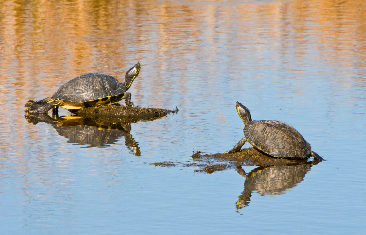
Although the image above is not a great image by any means, it does illustrate how I tried to work the scene to get the best image possible. First I moved horizontally along the bank of the pond to position the turtles on a diagonal line within the frame. Then I lowered the camera position to bring the reflection of grasses toward me, stopping at the point where the borderline between grass and sky reflection created somewhat of a S-curve across the frame, between the two turtles.
More Examples
This image, taken in the 1980’s, is a simple composition. The main subjects, the pier with fishermen, are all in one plane. The background sky is much more important than the foreground, which dictated low placement of the horizon line. The only other decisions were how large the pier was to be in the frame, and how much space to have in front of the pier. I stopped down to f16 to create sun stars in the pier lights.
Above is another sunrise image, but this one is more complex. There is more depth to the image, with interesting elements in foreground, middle ground and background. Placing an intentional foreground, midground, and background in an image creates visual depth, the illusion of the third dimension. It invites the viewer to spend more time exploring the different areas within the image. The visual elements that I wanted to include were the foreground fences, the pier house and pier, and the orange sunrise color. Once I decided on these visual elements, the composition was largely determined, and it was a matter of adjusting camera position to align the elements. I had to avoid a distracting bathhouse to the left of the frame, some distracting brush just out of the frame on the right., and I wanted to make sure I included the orange sky color on the upper right. The only distracting elements in the image were the brush between the fences in the left foreground. I did some light painting on the fences and sand to help emphasize them, and I darkened the brush during post-processing.
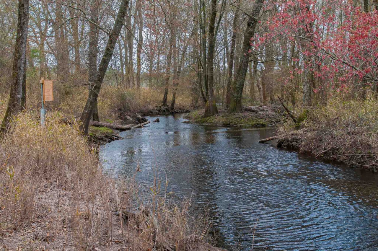
Another image with depth. After walking along both sides of the stream, I found a vantage point that allowed me to include the visual elements that most interested me: the mill, waterfall, reflections of mill/fall colors, and the tree on the left. I balanced the tree on the left with one on the right and the composition was set.
A large single symmetrical subject often looks best in the center of the frame.
The composition of this image was determined mainly by the necessary exclusion of distracting elements. Just to the left and parallel to the picket fence ran an ugly brown boardwalk. Just out of frame on the middle right was a parked car. A vertical framing between the two distracting elements was the necessary composition.
I was sitting on the ground, camera and lens on the ground in front of me. I composed the scene through a tilted rear lcd screen. I chose this placement of the subject relative to the background simply because it looked “best” to me. I liked the range of out-of-focus tones in the background (warm brown and green tones on the right to cool blue and gray on the left). I cropped some of the image from the top and bottom to narrow the out-of-focus zones.
The primary visual elements in this image were the lighthouse and buildings, and the pier/boardwalk. I thought the sky color on the left was also additive. I composed with the pier on the lower left leading to the lighthouse/buildings on the middle and right. Since the sky was overcast without stars, I did not feel that the area of sky above the lighthouse contributed to image impact. So I focused on framing to make the primary elements in the frame as large as possible.
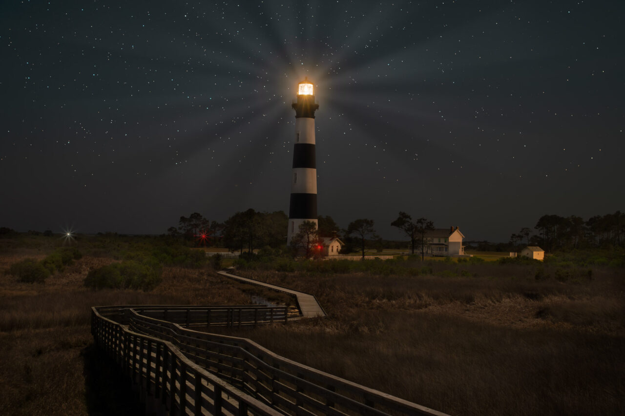
Years later I revisited the scene and tried to improve on the previous composition. The sky was clear and stars were present, but I still felt that the image looked better with the lighthouse and buildings large in the frame. I centered the lighthouse in the image so that I could include the additional building and tree line on the right.
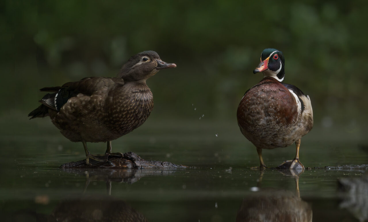
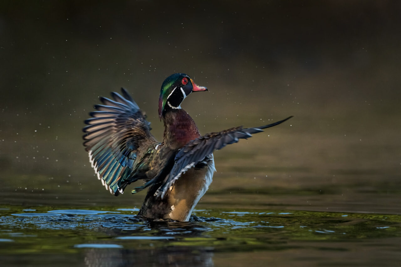
The important visual elements in this image were the two ducks, the colorful reflections and the feather. I positioned the camera so that the most colorful reflections were lined up with the ducks. I did not place the two ducks closer to the rule of thirds intersection because that would position the male wood duck too close to the edge of the frame. The image looked better with more space to the left of the male duck.
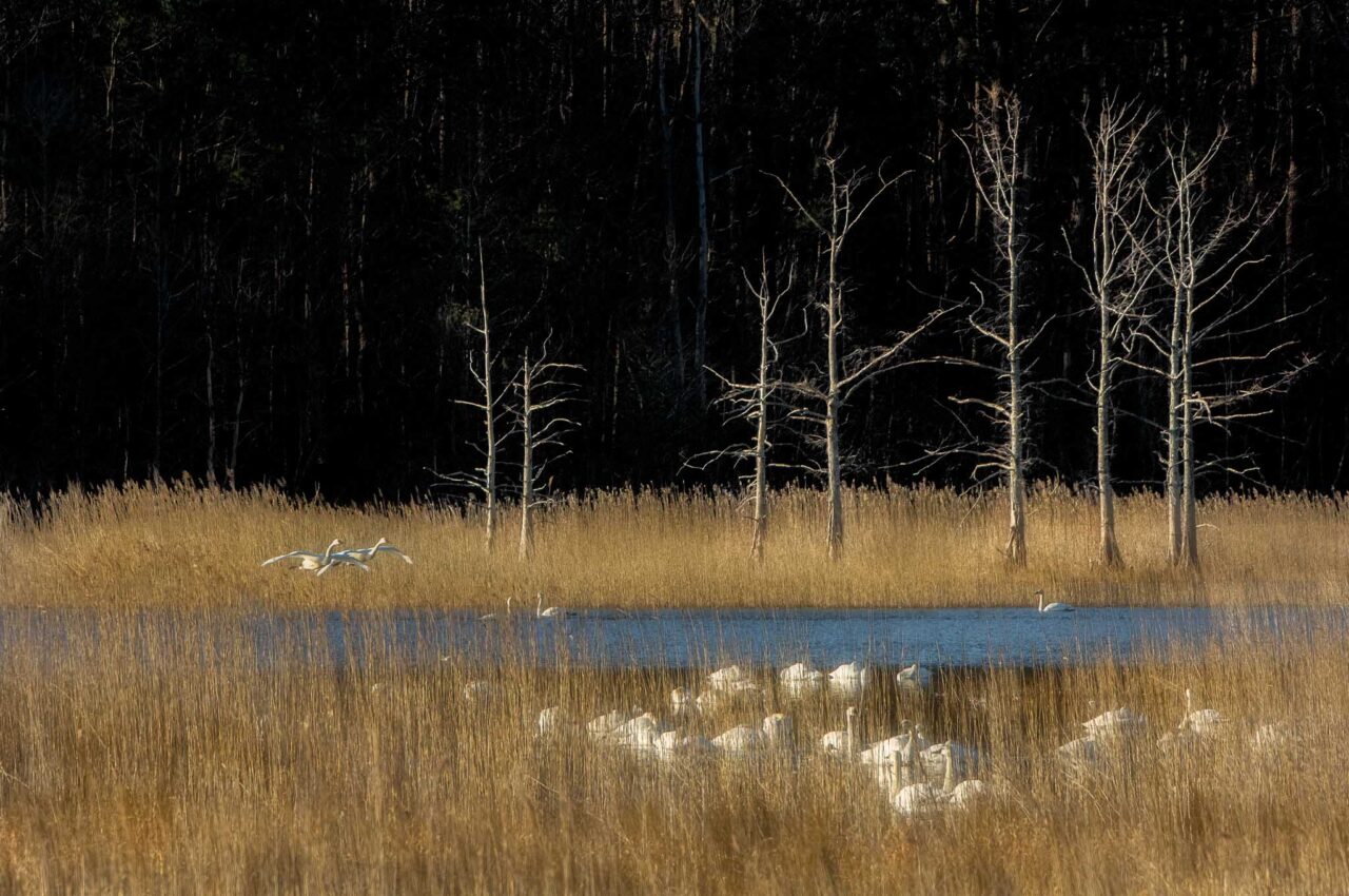
I found the stark bare trees, the blue pool of water and contrasting warm grasses an appealing setting for the tundra swans. I set up my tripod and waited, hoping that swans would soon fly to or from the scene. The potentially distracting background trees were fortunately shaded by other trees to the left. I framed the scene tightly to enlarge the swans as much as possible.
It is worth noting that none of the example images above were composed using rules of composition. None of the primary subjects were placed according to points on the rule of thirds, the golden mean, or any other predetermined ideal positions. It was more a matter of arranging the important visual elements in a pleasing manner while excluding distracting elements. Nearly all of my images are composed in a manner similar to these examples.
Try for Something Different
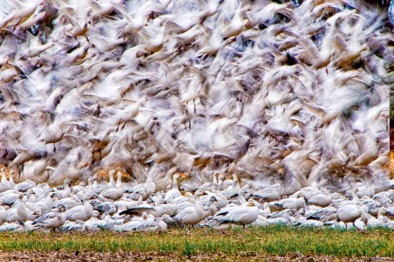
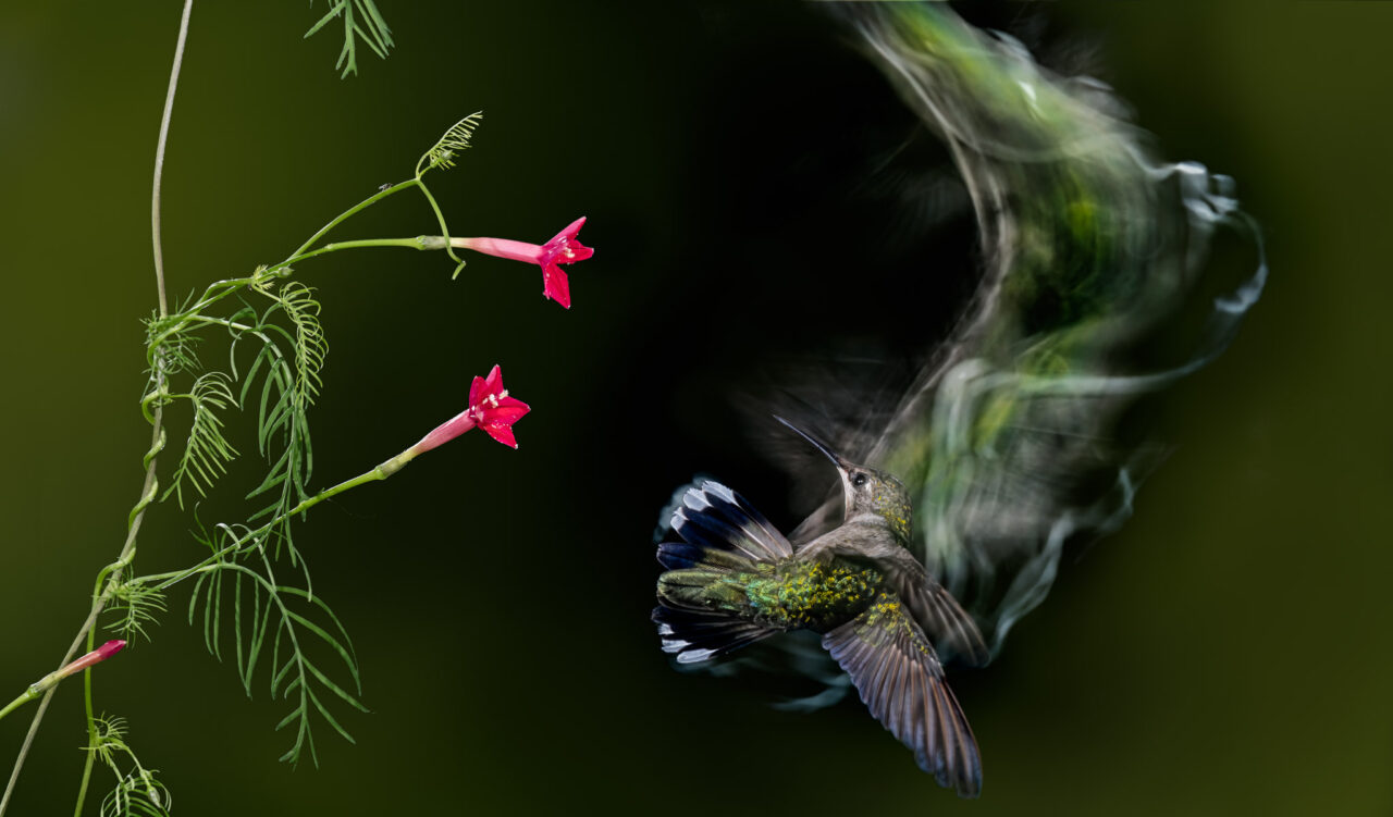
Different isn’t necessarily any better than the familiar, but it can be. If the image meets all the criteria for a good image discussed above and has an aspect to it that is a little less commonly seen, a little more unique, then this quality can significantly add to image impact and emotional response. Being proficient at a variety of camera techniques can be an advantage in creating images that are just a little more unique, such as long exposure photography, multiple exposures, or combining flash with slow shutter speeds. Below are a several examples.
Editing
Everything we have discussed to this point involves the first component of image making: the art of seeing and composing, or Vision. The second component is that of image optimization— Presentation or Expression. Photographer David duChemin says there are actually three images that go into the final photograph, “the image you envision, the image you capture in camera, and the image you refine in post-production.”
The importance of editing cannot be over-emphasized. Editing the image allows the photographer to enhance the appearance of the image and better direct the viewer’s attention to desired areas. I do this through tonal and color adjustments. I initially do some basic global edits in Lightroom, such as white balance, exposure, highlight and shadow adjustments. Then I move to Photoshop for most of my editing. Through the use of selections I selectively lighten and darken parts of the image, and adjust saturation and color. The types of selections I use are subject and background selections, luminosity selections, and color selections. I use Tony Kuyper’s photoshop plug-in TK9 for a lot of my tonal and color adjustments.
Below are some example Before and After images. The Before images are the images opened in Photoshop after Lightroom adjustments. The After images are the final edited images.
Sometimes the edits create an obvious dramatic difference in an image. At other times the edits are more subtle. The first image below was simply a documentary image for use in a slide presentation on wood ducks. I did however want to direct the attention to the central area of the frame. This was accomplished through selective dodging and burning in Photoshop using luminosity masks. The difference in appearance is significant.
The edits in the next image are much more subtle, darkening the background slightly and lightening areas of the ducks.
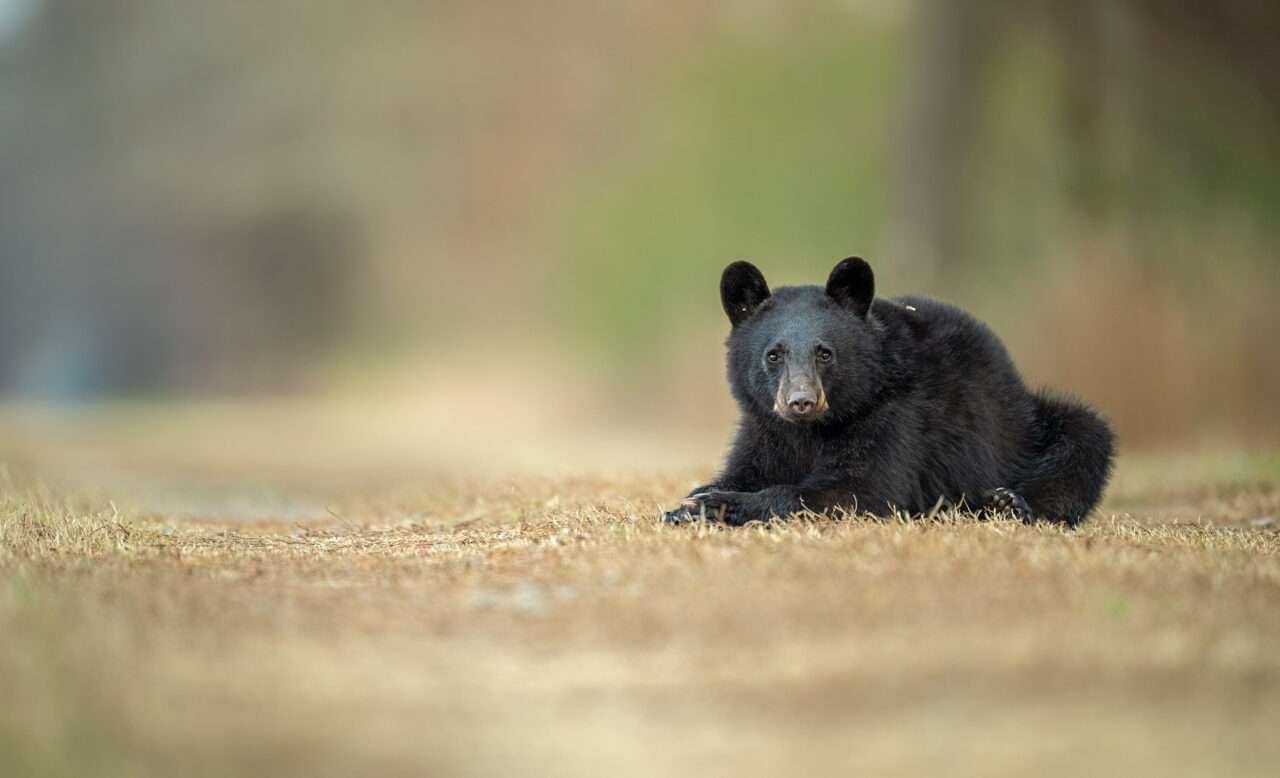
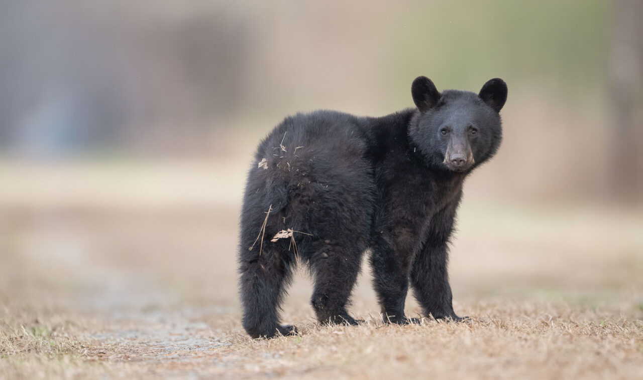
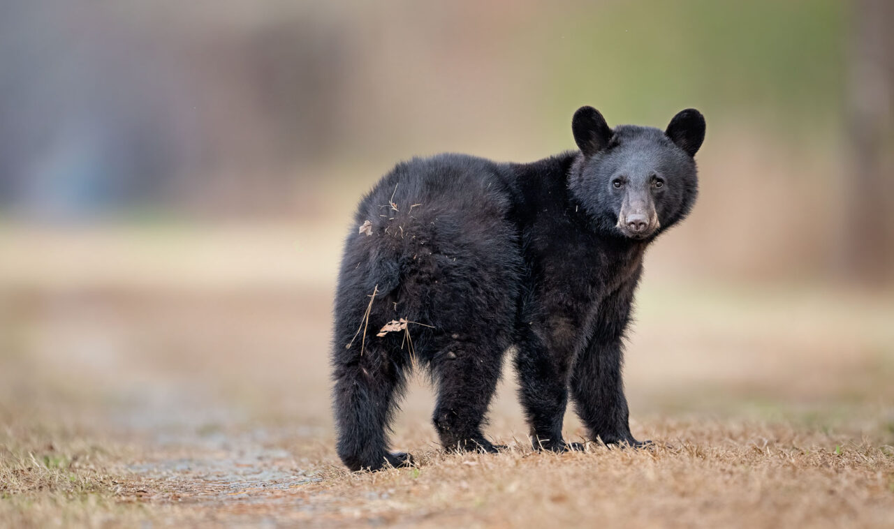
The editing choices in the image below were to increase the contrast, darken the foreground and background, and add a subtle vignette. The most significant edits involved dodging and burning the face of the bear to draw the viewer’s attention.
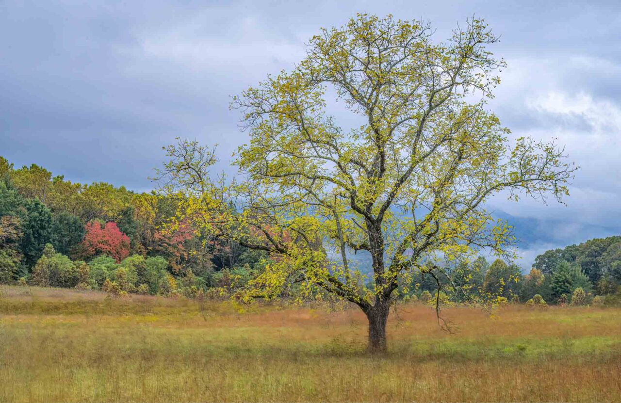
The most significant edits below made the tree even more of a visual focal point. Using luminosity and color masks, I darkened the trunk and branches, and increased the brightness and saturation of the leaves. Contrast and saturation of the surroundings were also increased. A subtle vignette was also added.
Edits in the image below included darkening the background, use of a vignette, as well as a saturation increase. The elk and the area immediately around it were edited to stand out visually through what I call a “spotlight” effect or inverse vignette. It is created by a heavily feathered (400-500 pixels) lasso selection of the desired area applied as a layer mask on a curves adjustment layer, The tonality of the elk was further adjusted through dodging and burning.
Edits below included a vignette, spot light effect and saturation increase–as well as selective dodging and burning.
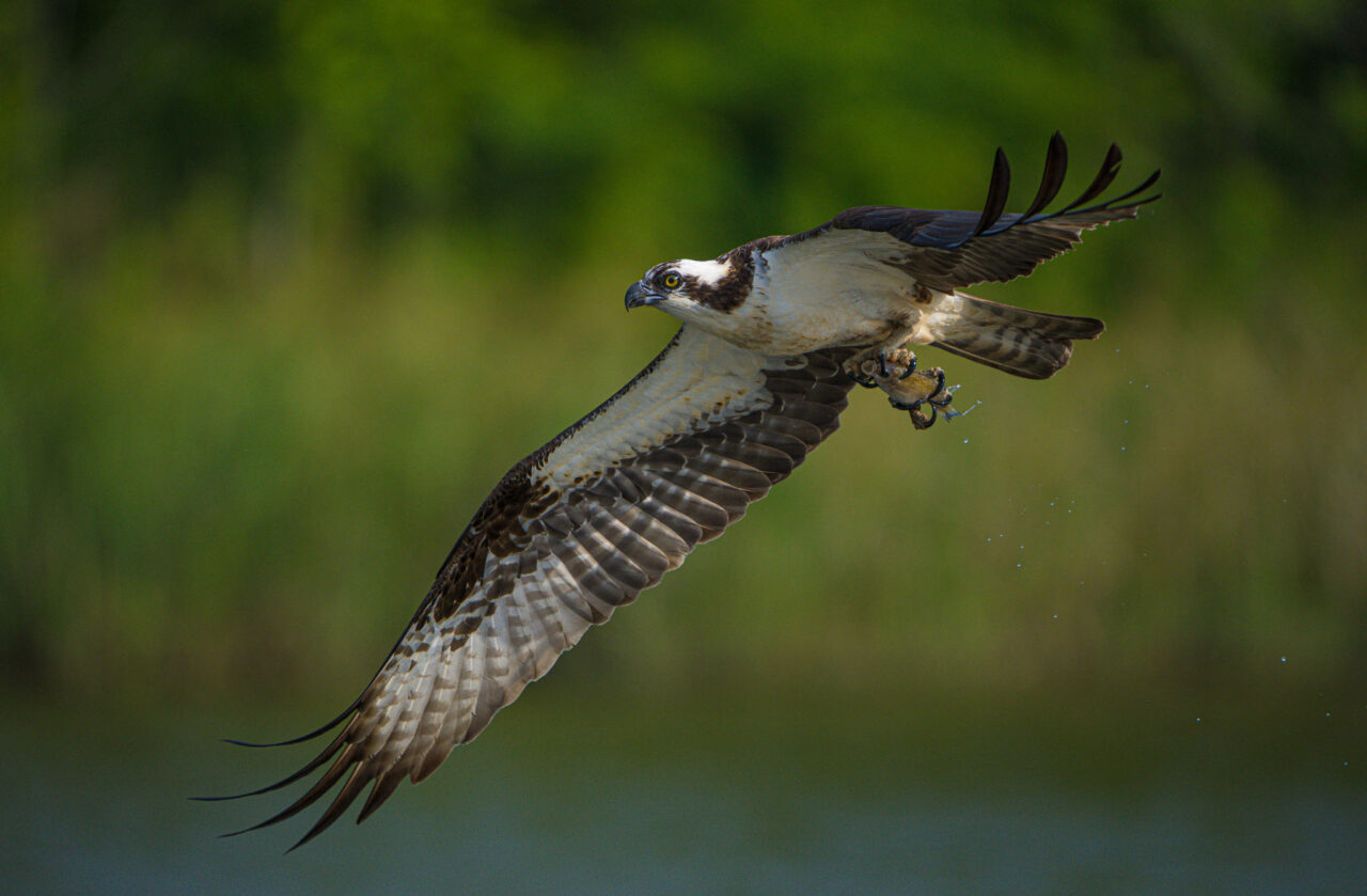
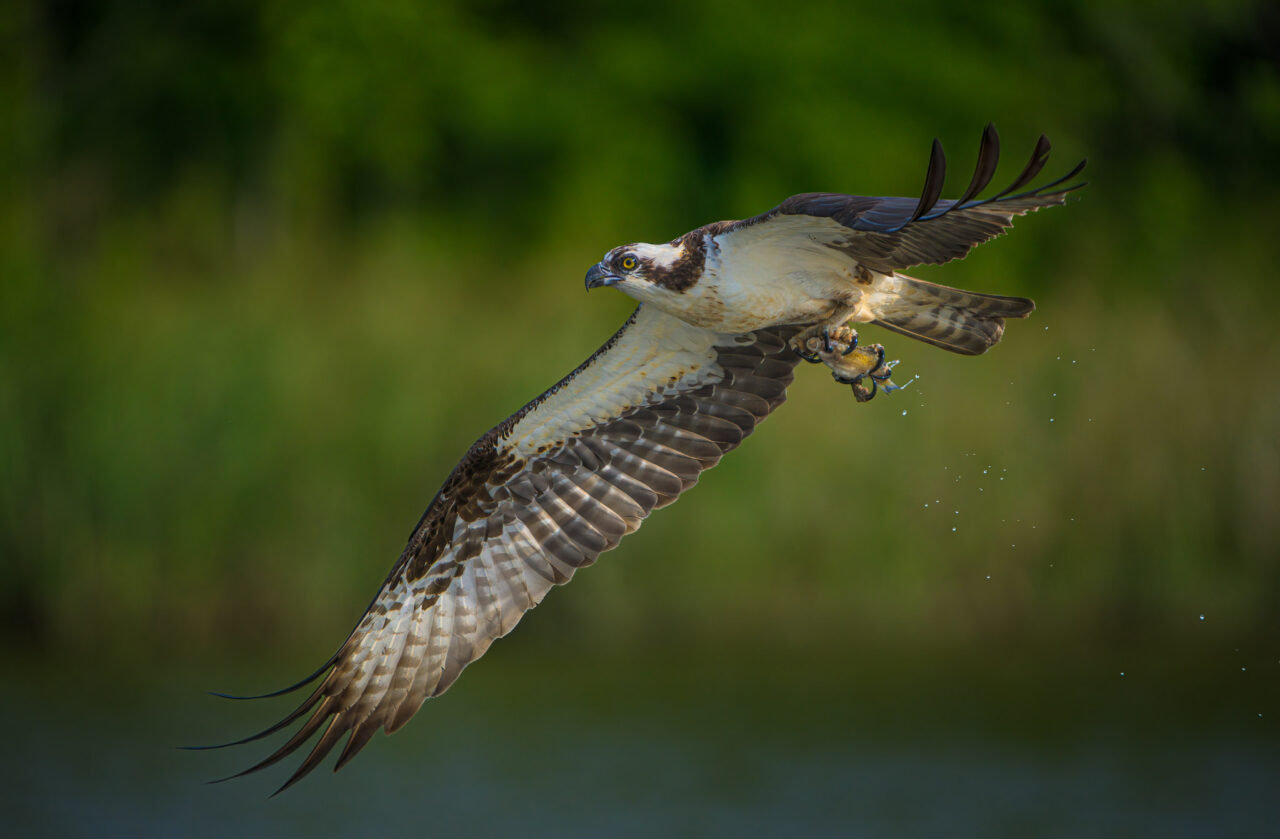
The image below was edited similar to the one above. Notice how the fish gripped by the talons visually stands out much more prominently in the second image. When you add a spotlight effect to a subject with bright whites, you have to prevent the whites from getting too bright through the use of a bright whites luminosity selection and layer mask.
Edits in the image below consisted of mainly localized dodging and burning, as well as a saturation increase and a warming filter added to the heron and portions of the foliage.
Other Considerations
You will get better images when you are mentally prepared for photography. That means being relaxed yet alert, your mind free of distractions. Another key step to making good images is to slow down, when possible, and visually explore the scene from different angles. Walk around the subject if possible, consider low or high angles of view. Even consider the options of shooting from directly above or under the subject, if possible.
Study the works of others. Many books and articles advise you to study the master painters to learn about composition. I suppose that could be useful, but I would first suggest you study the works of master photographers. I doubt there is much you could learn from studying paintings that you could not also learn from studying photographs. And with photographs you have the advantage of seeing how the photographer effectively chose and used his camera tools in creating the images. Tools such as lens focal length, exposure, shutter speed, aperture. Is there a particular technique or approach that you can adapt to your subjects?
Also study photographers in other genres. If you are a wildlife photographer, study the works of landscape photographers, photojournalists, street photographers, travel photographers. See if there are methods they use that you can adapt to your own type of photography.
Evaluate your own images carefully. Strive to make your images meet the standards of photographers or particular images you admire. Why did this image fail or succeed? What could you have done to improve this image? Looking at a particular image, can you find a better image within the image?
Make your subjects stand out: by color contrast, by selective focus, by light/dark (tonal) contrast.
In attempting to direct the viewer’s attention within an image, it is useful to remember the eye is generally attracted to: light before dark, high contrast over low contrast, sharp over soft/blurred, and bright over muted colors.
Avoid merges (overlap of subjects), particularly important with silhouettes.
Shoot at eye-level to your subject.
Leave more space in front of your subject, for implied movement or line of sight
Color: Use of complementary colors, Color contrast, warm/cool colors
Try to avoid having a horizontal background line of contrast bisect your subject.
If you tend to repeat certain types of errors, especially after a long layoff between outings, make a preshoot checklist
Keep a list of image ideas and locations as you think of them. If you later get in a rut or have a mental blockage, refer to this list.
Action/behavior is better than a simple portrait.
Interaction is better than action.
Addendum
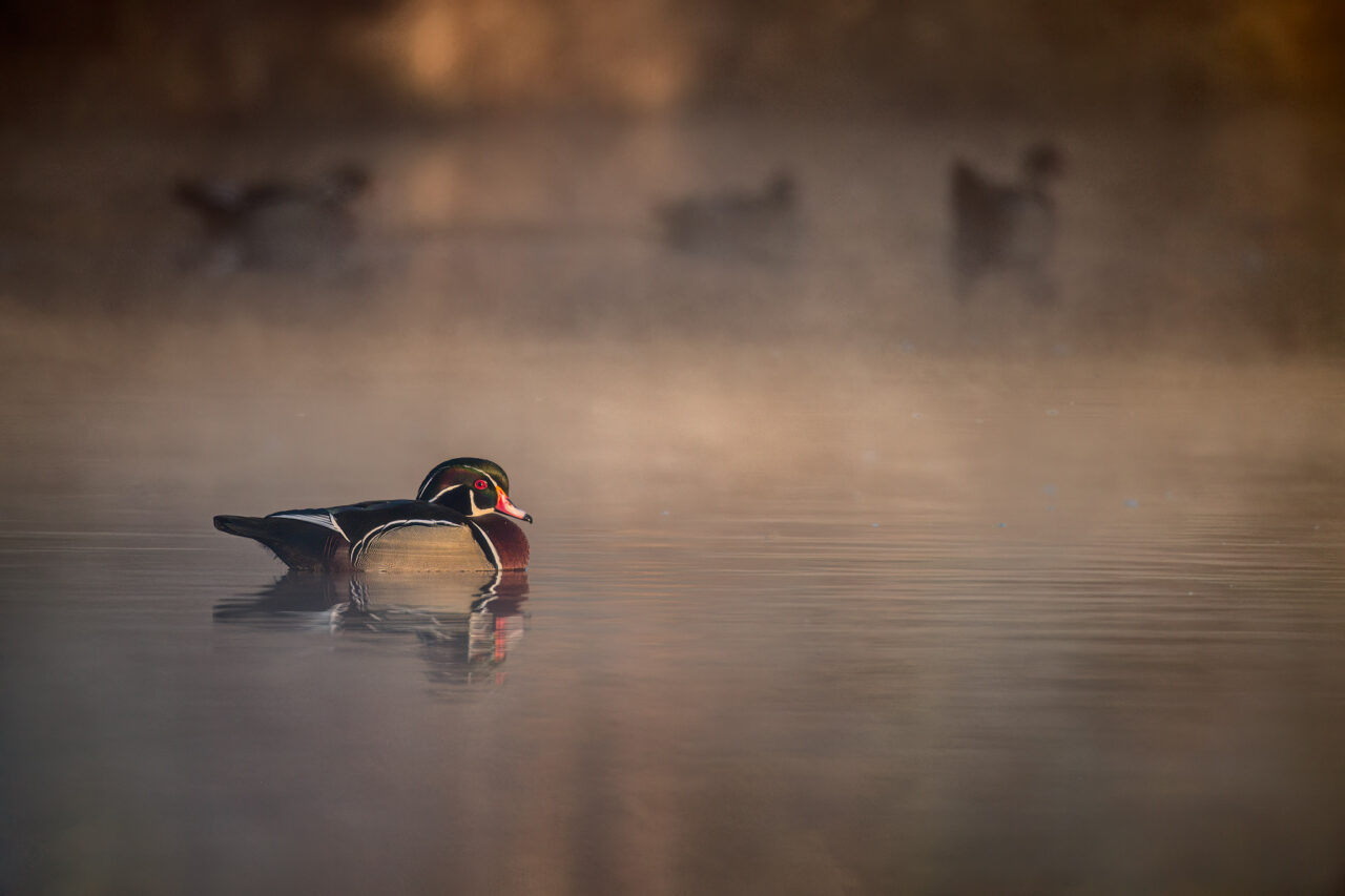
This article was originally intended to be just a brief discussion of a few qualities of a good image, perhaps just a couple of paragraphs; and then move on to a discussion about the opening image of Wood Ducks on a foggy morning. In particular I wanted to discuss the behavior captured within the image, shown again below.
The article somehow morphed into a more detailed discussion of composition. But since I went through the effort of writing the following section, I’m including it here, for those who might find it interesting:
Answering the question “What makes a good image?” is not the only reason I’ve written this article. I also wanted to discuss reasons why it is sometimes hard for a photographer to critically judge his own work. Jay Maisel wrote, “The most important thing for a photographer to learn is to be self-critical … If you’re not your own severest critic, you are your own worst enemy.” Strong words, but words that should be heeded if you want to take your photography to the next level. Yet being self-critical is not always easy.
One thing I’ve noticed is that some of my own favorites are favorites for reasons not readily apparent to others. I’ve touched on this subject before in an earlier blog post entitled Photographs and Memories. In that article I discussed how difficult it can be for a photographer to separate his memories of the photographic experience from an objective evaluation of an image.
The opening image of a Wood Duck drake resting peacefully on a pond is one I like a lot for several reasons. However, I suspect few viewers will recognize or appreciate one of the main reasons.
First, foggy mornings are among my favorite times to photograph wood ducks, particularly when the sun begins to burn the fog away, adding some warmth and drama to the scene. The presence of fog adds mood and obscures distracting background details, simplifying the image.
Second, I timed this image capture to coincide with the passing of three ducks through the back of the frame. While I did take some images without the other ducks, I much preferred the image above. I felt that the background ducks added secondary points of interest, giving the viewer a reason to linger longer with the image. Hopefully the viewer’s eyes would move from the foreground duck, then along the row of background ducks, pausing along the way to notice the fog, lighting and colors throughout the frame.
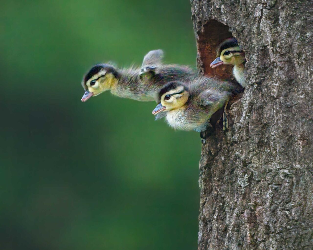
The third reason is the one I consider a big bonus. However only those with a knowledge of wood duck behavior can appreciate it. I have to admit I was really excited to capture the background ducks in the midst of performing the Turn-the-Back-of-the-Head courtship display. Since most viewers will not be familiar with this behavior, this big plus in my eyes, is lost to most.
I’ve always felt that wildlife photographers who research the life history and behaviors of their subjects will have an advantage in the field. First, they will better know where and when to find their subjects. Second, they will better understand the behaviors they see and can better anticipate when interesting action is about to occur. And, like me, they may find themselves getting excited about aspects of an image that others will not understand.
For those who might be interested, I will describe the courtship activity occurring in the image above.
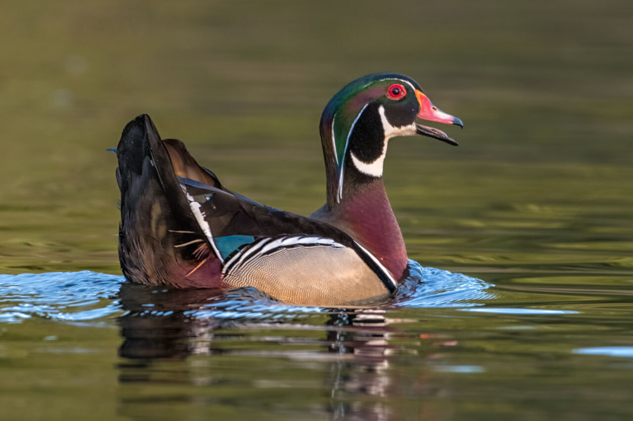
The-Turn-the-Back-of-the-Head display (TBOHD) is performed by the male in two common situations. In both situations it is thought to strengthen the pair bond between a mated pair of wood ducks. First, it is sometimes performed after copulation. The male will position himself in front of the hen and off to one side. He turns his head slightly to the side to point the back of his head toward the hen, at the same time flattening his crest against the back of his head and neck. He also raises his tail and rear end, directing it toward the hen. The tail is also usually tilted to one side.
The second, much more common, situation where TBOHD is performed occurs after interactions with other male wood ducks. It is generally viewed in conjunction with female inciting or bill-jabbing displays. This interaction is what I captured in the initial image in this article.
Wood Ducks do not have territories like many other birds, i.e. specific areas that contain nest sites and food sources that they defend from others. The hen, if on the nest incubating eggs, will defend her nest cavity from another hen. The male, however, has no specific territory at all. Once paired he will defend his mate from approach by other males. In a sense he has a small roving territory that surrounds his mate. When another male approaches too closely he will interact with that male in one of several ways. The initial response by both drake and hen is to perform the inciting display. Inciting consists of aggressive rapid pointing or jabbing motions of the bill toward the intruder.
Often inciting is enough to end the interaction and the intruder retreats. If the intruder remains but is not overly aggressive, the male will try to lead the female away by performing the TBOHD display while swimming away from the intruder. The hen will follow, often continuing the inciting action in an over-the-shoulder action or in a forward direction, Sometimes the inciting action is modified into a bill jabbing action. In the bill jabbing display the bill is repeatedly jabbed down into the water.
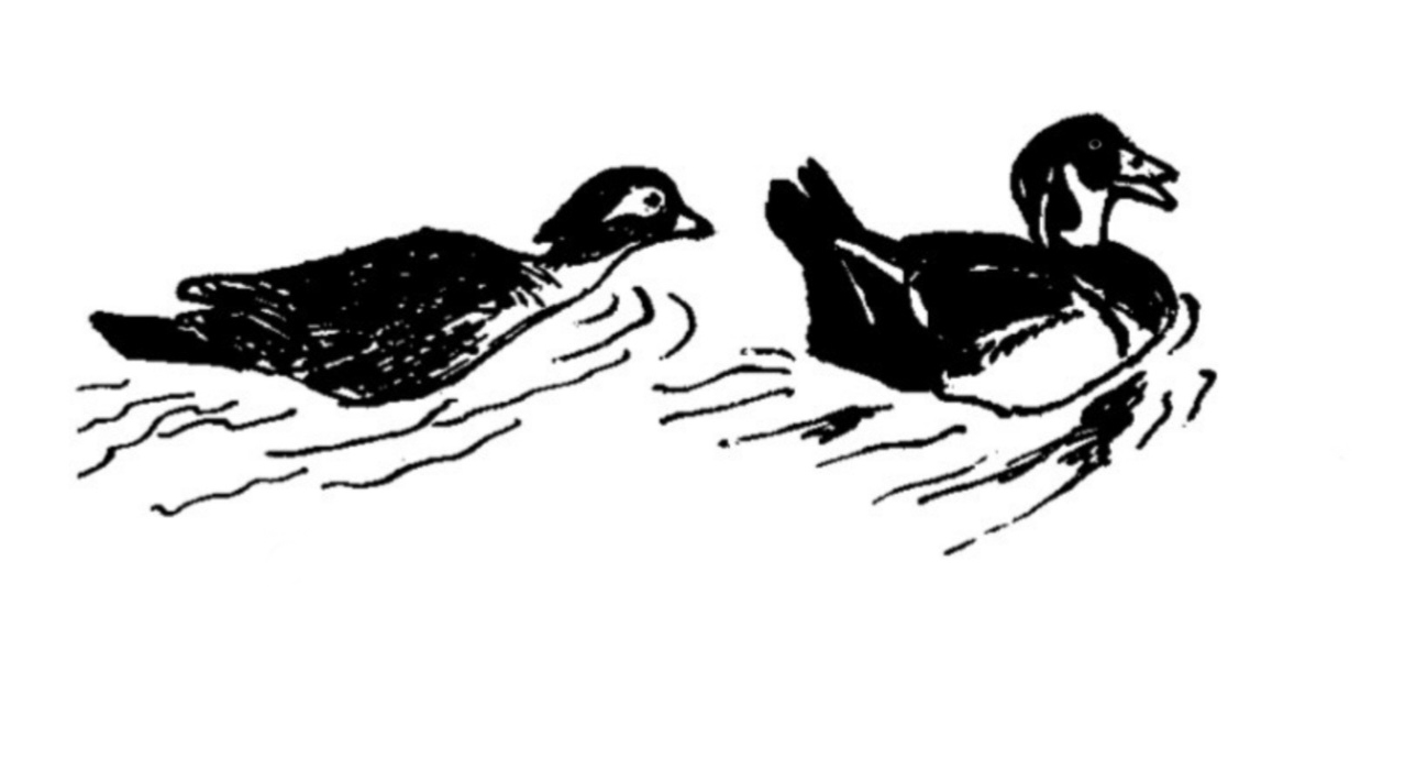
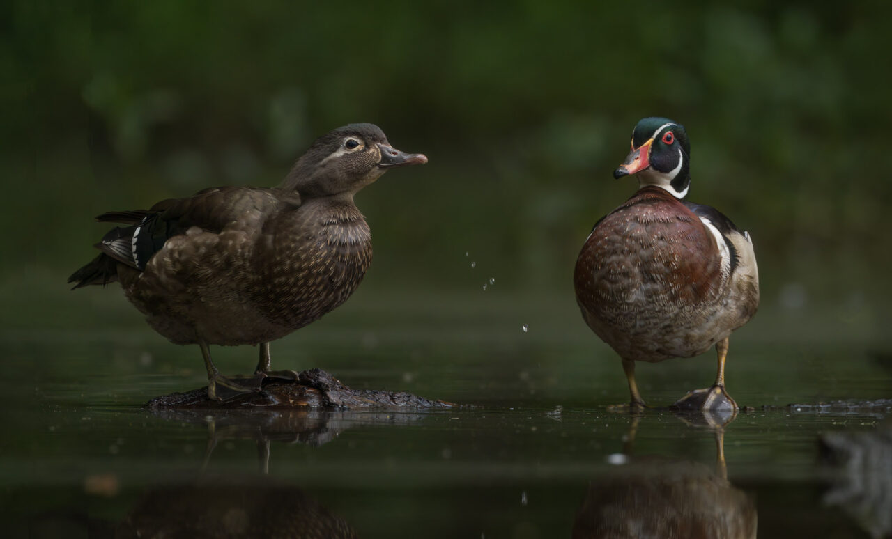
In the photograph below, the hen is bill-jabbing as she follows her mate.
In this article’s initial image (shown again below), the male intruder, maintaining a respectful distance, is still following as the male performs TBOHD and leads the hen away. I personally really like the presence of the background ducks in the image, especially because of the behavior captured. Others may find the background ducks distracting.